The Sunday Times recently reported that the Minister of Cooperative Governance and Traditional Affairs, Nkosazana Dlamini-Zuma (NDZ), presented a plan to the ANC’s national executive committee about building a new smart city on the Wild Coast. How bizarre, how bizarre. Where would the money come from to build such a city? Certainly not from the private sector. I would have thought NDZ and the rest of her command council members would have better things to do than to dream about pies in the sky. Perhaps someone senior in the ANC should remind NDZ that we are in the midst of a pandemic and that our expanded unemployment rate presently stands at a staggering 44.4%. Oops, I forgot, the ANC loves dreaming up mega projects such as building nuclear power stations, 20-year emergency electricity procurement from floating power plants and upgrading Prasa’s locomotive fleet. The playbook hardly varies and corruption abounds.
I bravely read Duma Gqubule’s opinion piece in the Business Day on 4 October 2021. His columns are somewhat unorthodox and he has some interesting proposals to solve South Africa’s many economic and social crises. His latest advice revolved around the proposed basic income grant (BIG):
“…In a paper that will be released soon I looked at eight scenarios for implementing a BIG and settled on one. This involves a three-year implementation of a debt-financed BIG for adults aged 18 to 59 at the upper poverty line of R1,335 a month, and extending it to children who currently get the child support grant, which is way below the food poverty line of R624 per month.
Assuming a 60% uptake and a clawback from taxpayers and after taking into account planned spending on the child support grant, the proposal would provide a R360bn stimulus to the economy over three years. This would eliminate poverty, result in an annual average GDP growth rate of 4.8% and create 3.7 million jobs…”
Oh my goodness, why didn’t anyone think of such an elegant solution to end poverty and reduce unemployment before? I am not an economist but I have seen the end results of such money printing adventures. Think Zimbabwe, think Venezuela.
I joined Twitter earlier this year after avoiding this social media platform like the plague for years. I was starting to doubt the integrity, objectivity and independence of certain mainstream media outlets so I thought it would be useful to gain insights from interesting people. Twitter has proved to be a treasure trove of information, disinformation and misinformation, and a platform to allow people to be rather nasty to each other. I ignore all the negative stuff and fact check often. I currently have three followers and my ego would love to reach 50 followers by year end, so please find me @GregBeech3. Talking about Twitter, the infamous Piers Morgan tweeted yesterday about a topic that should be avoided at all costs to preserve family harmony and retain friendships:

I have been avidly following Covid-19 death data globally since March 2020. Most of us have seen the destruction that the SARS-CoV-2 virus has wrought in our communities. I have lost an aunt to Covid-19 and some of my friends have landed up in ICU. This virus is deadly to some and I have been terrified by the excess deaths statistics published weekly by the South African Medical Research Council (SAMRC) on its website www.samrc.ac.za. Last time I checked, SAMRC estimated that over 260,000 more souls had passed than predicted over the period May 2020 to September 2021.
However, I have some gripes with SAMRC’s excess death reporting:
- When publishing weekly excess death data, they remove the previous reports and Excel files. Hence, unless you download these reports weekly, you cannot access prior reports. I would have thought transparency and access to data would be paramount in the midst of a pandemic?
- To my knowledge, SAMRC did not publish their actual weekly predicted natural deaths until May 2021. Previously, the public had to blindly believe SAMRC’s narrative about excess death data without access to the underlying benchmarks.
- SAMRC treats negative excess deaths (less deaths than predicted) in any particular week as zero instead of subtracting these from the rolling total of excess deaths. Somewhat disingenuous if you ask me.
- SAMRC had until August 2021 not included natural deaths (estimated and predicted deaths) of less than 1 year olds in its data sets. It now includes these in its estimate of excess deaths, thus making prior comparisons difficult.
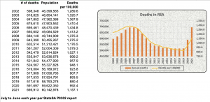
I resorted to Statistics South Africa’s (StatsSA) mid-year population estimates and death data in its PO302 reports to get another perspective on the potential extent of excess deaths in South Africa. These reports contain estimated deaths for periods commencing on 1 July and ending 30 June of the following year. I took the liberty of calculating the estimated deaths per 100,000 over the past 20 years and charting this.

The death data per capita for the year ended 30 June 2021 was concerning however, nowhere near as bad as 2006. That was the height of AIDS denialism by certain senior ANC cadres. HIV/AIDS remains a serious problem in South Africa. SAMRC in its National Cause-of-Death Validation Project report dated July 2020 refers to research that estimates that 29.1% of all deaths in 2012 in South Africa were HIV/AIDS related.
The ourworldindata.org website (OWID) contains huge amounts of Covid-19 data globally. I downloaded their 30 September 2021 Covid-19 Excel files and analysed annual death data of 60 odd countries for the 6 years from 2015 to 2020. I calculated average annual deaths per country for 2015-2019 and compared this to deaths in 2020. Higher deaths in 2020 compared to the average of the previous 5 years were regarded as excess deaths. No attempt was made to attribute excess deaths to Covid-19 but rather to consider excess deaths from all causes. Excess deaths in 2020 were expressed as a percentage of the average over prior 5 years. Refer attached for my Excel workings should this be of interest to you Excess death estimates based on OWID data (Sept 2021). Interestingly, there was no death data for South Africa or China provided by OWID.
OWID also publishes lockdown stringency measures (between 0 and 100, with 100 being the harshest lockdown measures) per country per day. OWID also provides inter alia, median ages per country, vaccination statistics and diabetes prevalence. My hypotheses were:
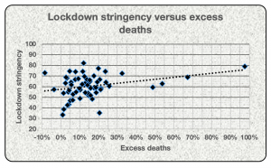
- Countries with the harshest lockdown measures for the period 12 March 2020 (pandemic declaration date) to 30 September 2021 would have the lowest excess death counts.
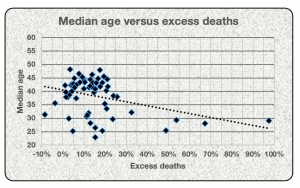
- Countries with the lowest median population age would have the lowest excess deaths based on the assumption that older people face higher mortality risk.
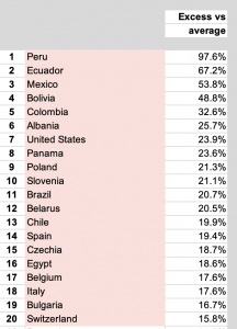
The results of my analysis had me confused. The 20 countries with the highest excess deaths were:

Certain South American countries were badly hit in terms of mortality in 2020. Peru had ±215 million deaths from all causes in 2020 compared to an average of 109 million in prior years. Mexico recorded 375 million more deaths in 2020 than in prior years whilst Brazil recorded an extra 271 million deaths. USA topped the list in terms of sheer numbers with an estimated 664 million higher deaths than normal.
Uruguay had ‘negative’ excess deaths in 2002. Australia and New Zealand emerged relatively unscathed in 2020 with 3,400 and ±500 excess deaths respectively in 2020 per my calculations.
Returning to my first hypothesis, there was no clear pattern between lockdown stringencies and excess deaths.

I would need an actuary to advise on the correlation between excess deaths and lockdown stringencies in the 60 selected countries. I used Excel’s CORREL and RSQ functions to estimate the relationship between these datasets. It revealed a correlation of 0.30 between lockdown stringency and excess deaths, not a strong correlation at all. The RSQ function in Excel provides an estimated ‘measure of fit’ between two variables. A R-Squared score of 1.0 would essentially mean that excess deaths could be completely explained by lockdown measures. Conversely, a R-Squared score of 0.0 could be interpreted as lockdown measures having no impact on excess deaths. The actual R-Squared score between the datasets was calculated to be 0.09, meaning excess deaths were largely unexplained by lockdown measures.
My second hypothesis was that countries with higher median ages would fare worse in terms of mortality than countries with younger populations.

The scattergraph above also reveals limited correlation between excess deaths and median ages. The CORREL function result was -0.36, which was a complete surprise. I interpret that as meaning that there was limited correlation between median ages and excess deaths, and if there was, it was negative (countries with younger populations tended to have worse excess death outcomes than countries with older populations). The R-Squared result for median age versus excess deaths was 0.13, revealing limited fit between the datasets.
I will leave to ponder on these apparent contradictions. Stay safe and all the best from BeechieB.

Recent Comments