
SARS-CoV-2, the virus that can cause COVID-19 (the disease), has provided so much data for modeling purposes. I have been having fun analyzing various data sets relating to COVID-19. That sounds morbid but the reality is that the challenge of extracting huge amounts of data and converting that into potential information is rewarding. This blog post is going to be more about charts than words. Charts can tell a story in a different way to words. Charts can also be manipulated to provide misinformation. I trust that the ones I share with you reflect reality and not some mirage.
I will be sharing eight different charts below. When you review and analyze these, I would urge you to ask yourself three questions:
- Which of the waves were bigger per country – the first or second wave?
- Why?
- Was there any relationship between the peaks and troughs of the waves and lockdown stringencies?
I sourced the data used for the charts from www.ourworldindata.org (OWID). This website is a treasure trove of information and in turn sources its data from various credible sources. When creating charts of 7-day moving average deaths (death reporting by day is often noisy, so moving averages are probably smoother), I tried to compare countries which are adjacent to each other and roughly on the same latitudes. The underlying data is from the start of 2020 to 8 March 2021.
First up, let’s compare Czechia (the country with the worst deaths per capita) to its neighbor Austria.

Clearly, the second waves were far more destructive than the first blips. It would appear to the naked eye that the hard lockdown flattened COVID-19 deaths in Czechia but perhaps at the cost of a brutal second wave. Interestingly, the lockdown measures in Austria appear to mirror the death toll except in January and February 2021?
Okay, let’s compare Germany and its neighbor France.

The virus appeared not to ‘listen’ to German authorities as it ripped through the population irrespective of lockdown measures. France has a steeper first wave and the virus reappears later in 2020, as apparently respiratory viruses are wont to do.
Next up is France versus Italy (sounds like a football match?).
 I remember the video footage of hospitals in Northen Italy in March 2020 – it was a horror show. Unfortunately, Italy paid a heavy COVID-19 price, with one the worst per capita deaths globally. Have you noticed how the waves in adjacent countries occur in very similar time periods, albeit that the severity may differ?
The patterns in Croatia and Hungary were intriguing, similar to Austria and Czechia.

Unfortunately, both Croatia and Hungary have had very high mortality rates from COVID-19 by global standards. There seems to be a pattern here? Hard lockdowns initially, small first waves and then mayhem in the second wave.
Boris Johnson reportedly said in January 2020 that the best thing for the UK to do would be to ignore the COVID-19 outbreak in China and that an overreaction to the virus may cause more harm than good. Well, we know how that ended. Bonking Boris landed up in ICU in April 2020 and the UK implemented some of the harshest lockdown restrictions known to mankind. Neighbours were encouraged to spy on each other and police enforcement of lockdown rules was a bit too enthusiastic at times.
 Here again, COVID-19 deaths occurred irrespective of the draconian quarantine measures in the UK. Mortality rates from or with COVID-19 in Belgium and the UK were both in the top 5 in the world as at February 2021.
I have some friends based in Turkey and I have followed their social media posts over the past couple of months with great interest. Sadly, they too have experienced quarantine measures and were only recently allowed back out on weekends.
 I warned you that charts can sometimes deflect from the real story. Well, Bulgaria got blitzed by COVID-19 and by 8 March 2021, the country had recorded 162 deaths per 100,000 population. Turkey fared far better at 35 deaths per 100,000. Bulgaria has a population of ±7 million whereas Turkey is far more populous at 84 million.
You may be having ‘chart fatigue’ at this stage. Bear with me for two more charts and some explosive economic data.

Some media have been very harsh on the Swedish Public Health Agency’s response to COVID-19, calling them reckless for not imposing harder lockdowns. There has been speculation that the Swedish government’s primary strategy in the midst of the virus was for the population to achieve herd immunity. Sadly, Sweden’s mortality rate was 11 times that of its neighbor as at early March 2021.
Ok, last chart for you.
 If the data from the USA and Canada does not convince you to question whether lockdown measures have any impact on halting the SARS-CoV-2 virus spreading through the population, then you may be visually impaired. I know the USA is a vast country comprising 50 different states and hence, it may not be accurate to compare the country as whole to other countries. From the published data I have seen, COVID-19 mortality rates have varied from state to state and without much correlation to lockdown measures.
I was intrigued to research whether there was any correlation between COVID-19 outcomes and economic growth/contraction in 2020. I stumbled upon IMF data about long-term GDP data per country including 2020. I tried not to look at Venezuela’s performance but I could not stop myself. That social paradise’s economy contracted by 25% in 2020 after declining 35% the year before. 2018 was slightly better at negative 19.6%. To put that in perspective, if Venezuela’s economy was US$124 billion at the start of 2018, it would have contracted to US$48.6 billion by the end of 2020. Note to Cyril, perhaps don’t ask your Twitter mate, Nicolas Maduro, for economic advice or any other earthly pearls of wisdom.
My hypothesis when analyzing COVID-19 mortality rates and GDP statistics per country was that harsh lockdowns = poor economic outcomes but better healthcare results. I selected 55 countries globally from the IMF and from the OWID website. I tried to focus on the major countries from a population perspective and omitted countries where I suspect truth may be an inconvenient distraction (think Russia). Have a look at the data below regarding the 20 worst affected countries.
 Oh my goodness, I was questioning whether I had extracted the appropriate data, so I double checked. Yip, the data accords with the original sources. So how do you explain that 11 of the countries with the worst performing economies in 2020 also had some of the highest COVID-19 mortality? It makes no sense at all. It gets worse.
 My hypothesis is now completely threaded. 12 countries whose economies escaped relatively unscathed in 2020 also had very low COVID-19 mortality rates. I am calling on all economists, public health officials, epidemiologists, virologists, actuaries and any credible scientist to explain the above data. Using Excel’s CORREL function, the correlation between COVID-10 outcomes and GDP data for the 55 selected countries, was -91%. Countries with high COVID mortality most of the time had poor economic outcomes in 2020 whilst countries that had low COVID-19 mortality achieved better economically. It is inexplicable to me.
PS, South Africa has had the 27th highest number of COVID-19 deaths per capita and the 40th best GDP result out of the aforementioned 55 countries. Pretty awful, me thinks.
All the best from BeechieB.

 To be fair, the DBE had not yet released the Western Cape’s matric results by the time of publishing the NSC report, so an Excel or Numbers file may in the offing. Talking about NSC results, I was deeply disturbed by the raw data. Perhaps I should not have read the report and examined how poorly our 18 year olds (some may be younger and some may be older) performed in their final written assessments. Approximately 40% of the total cohort took mathematics in grade 12 and wrote the exam. Of those, 22% managed to obtain a mark of 50% or more. Sadly, only 3.2% achieved a distinction. I am not sure how employable you would be in the future smart city around Lanseria and amidst the Fourth Industrial Revolution without a reasonable mathematics foundation.
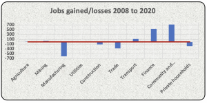 The manufacturing sector has been a blood bath with a loss of 607,000 jobs over the past 12 years. Employment conditions in the construction and trade (I assume retail) sectors have not been great either. Interestingly, the finance sector has created 543,000 jobs whilst the ‘community and social services’ sector added 720,000 odd jobs. I am guessing that the community and social services jobs entail mostly public sector employment, those fine people in parliament and in education and in healthcare. The latter hare to be applauded for their efforts amidst this pandemic. The educators less so.
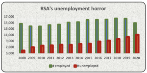
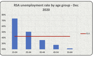 The expanded unemployment rate amongst 15 to 24 year old South Africans was a staggering 74% in the last quarter of 2020. Amongst 25 to 34 year olds, it was 51%. It seems the older are less afflicted. The median age in South Africa is 27 and 54% of our population is under the age of 30. I would opine that we have a humanitarian crisis in South Africa with regards to employment and unemployment levels.
 Picture courtesy of the New York Times
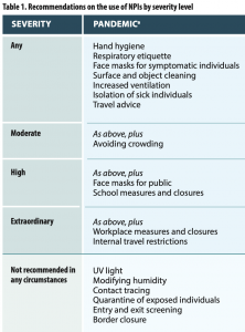 Notice that increased ventilation is recommended and not beach closures. Notice that contact tracing and quarantine of exposed individuals (aka lockdowns) are not recommended in any circumstances. And no border closures please! The WHO’s views on school closures in their 2019 document seems balanced and sensible, I quote:
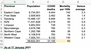
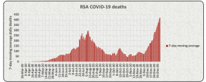
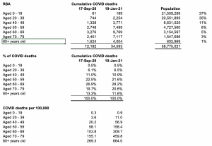 South Africa has a youthful population – ±72% of our population is under the age of 39 with a median age of 27. SARS-Cov-2 is particularly severe for the elderly and South Africa’s data supports this. Notice the much higher deaths per 100,000 for 70+ year olds as compared to the 20 to 39 age bracket? Our age based COVID mortality is not great compared to most European countries but that is another blog post on its own. COVID deaths have dramatically increased in the past 4 months. The percentage of total COVID deaths per age profile is very similar to what it was 4 months ago, not supporting the theory of the second wave hitting younger people harder than previously. Over 60% of all deaths from COVID to date in South Africa were people 60 yers or older.
 I had some spare time this week so I downloaded the Airbnb prospectus and had a long read – the document was over 489 pages! Here are some interesting facts about Airbnb:
 You may recall Dr Ngubane’s (chairperson from 2010 to 2013) antics at the SABC and subsequently as Eskom chairperson. Ms Suzanne Vos made some damning statements about Dr Nbubane to the Parliamentary Monitoring Group in March 2013 following the mass resignations from the SABC board. She stated that Dr Ngubane was prone to making unilateral decisions without consulting the rest of the board of directors. He attempted to overturn board decisions such as the relieving Hlaudi of his position as acting COO. Dr Ngubane apparently also failed to attend meetings if he was angry or did not get his own way. That type of behavior clearly works as he was then entrusted to chair Eskom through difficult times. He was spectacularly unsuccessful at that and we are all living with the consequences of irregular power and another debt laden SOE (refer an earlier blog about Eskom and its inability to trade out of its debt burden).
 The ANC seemed to take the Department of Communications seriously at the start of its rule by appointing heavyweights such as Pallo Jordan to oversee matters. Unfortunately, some of the appointees over the past 10 years had questionable reputations. Dina Pule was apparently adept at lying and cheating to benefit her then boyfriend back in the days. Faith Muthambi has been implicated in state capture given evidence at the Zondo Commission. She must have done some naughty stuff for OUTA to have laid treason and corruption charges against her in 2017. Mention Nomvula Mokonyane and I think Bosasa and Xmas braai packs. Stella Ndabeni-Abrahams was caught flagrantly disregarding lockdowns regulations earlier in 2020. She is now in the news for overturning the SABC board of directors decision to retrench 400 employees. Perhaps Stella needs to do a Corporate Governance 101 refresher.
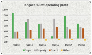
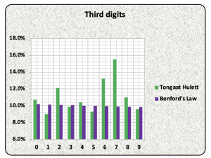
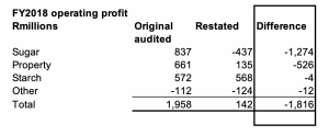 The Sugar division’s operating profit of R837 million descended into a loss of R437 million in FY2020 due to the aforementioned reasons. The Property division was also apparently a bit naughty, recording land sales upon signature of agreements rather than upon transfer. The division also saw fit to occasionally lend money to potential buyers to fund the acquisition of properties from Tongaat. No wonder Hudson and his team were struggling to collect some of their debtors book during 2019.
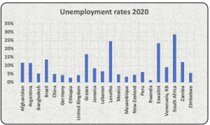
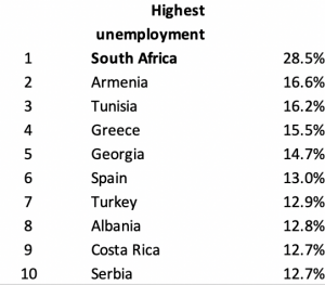 Unfortunately, South Africa also has the highest unemployment rate of the countries surveyed. The above 28.5% unemployment is from 2018 data from the World Bank. A further estimated 2.2 million jobs have been lost since lockdown and our unemployment may well be higher than StatsSA’s current estimate of 42% on an expanded basis. Nic Spaull, who spearheads the Nids-Cram National Income Dynamics Study, estimates that there are currently 14.3 million people employed in South Africa versus 16.5 million unemployed. I am too terrified to ask him what youth unemployment rates are.

Recent Comments