Category: Uncategorized (Page 2 of 4)

Let’s talk about executive remuneration

When the Johannesburg Stock Exchange (JSE) introduced the requirement for listed companies to disclose the remuneration of executive directors in the early 2000s, I was on record warning about the unintended consequences of this. I argued that by making executive pay public knowledge, the average remuneration of directors would generally rise as individuals demanded comparative pay to their peers. Previously, executive remuneration was not in the public domain and hence, it was difficult for executives to benchmark executive pay except anecdotally.

The Companies Amendment Bill of 2021 in South Africa proposes taking disclosure of executive remuneration a step further. It proposes the disclosure by state-owned and public companies of:

  • the total remuneration (guaranteed salary, benefits and other incentives) that has been paid to the highest paid employee and that of the lowest paid employee
  • the average and median remuneration of all employees
  • the gap, expressed as a ratio, between the top 5% highest paid employees and the bottom 5% lowest paid workers

The U.S. Securities and Exchange Commission (SEC) introduced similar disclosure requirements in 2015 for all listed USA companies. Their requirements are simpler requiring only the disclosure of what the CEO earns versus the median (mid-point in the data set) of all its employees except the CEO. The Marxist leanings of the ANC government is clearly evident in the Companies Amendment Bill 2021, requiring public and state-owned companies to publish what the highest and lowest paid employees earn, which will reveal a much worse pay gap than comparing the CEO’s paycheck to the median salary of all employees. I also venture to guess that the pay gap ratio at our bloated state-owned entities will be much lower than in the private sector.

The Economic Policy Institute based in Washington D.C, recently published the CEO-to-worker compensation ratio (average remuneration of CEO versus the average worker in that firm’s industry). According to their calculations, CEOs earned 351 times more than the average pay packet of all employees. This ratio reached a peak in 2000 during the dot.com boom but 2020’s result, whilst in the midst of a pandemic, is near that peak.

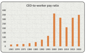
As can be seen in the above chart, the CEO-to-worker pay ratio was ±20 times in 1965. It has increased steadily over time, which may be due to lucrative share incentive schemes which enrich the top executives rather than the masses.

McDonald’s CEO, Chris Kempczinski, earned a total of US$10.8 million in 2020 which was 1,189 times higher than the median salary (US$9,122) of McDonald’s employees. The pay ratio is calculated as CEO remuneration divided by the global median salary of McDonald’s workers. I would be guessing that a griller in Phuket, Thailand would not be earning the same as his/her counterpart in New York.

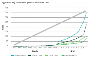
Deloitte in its September 2021 report, “Your guide: Director and prescribed officer remuneration at JSE listed companies”, reveals that the total guaranteed pay (TGP) of CEOs versus the general worker of JSE listed companies is similar to the USA experience. Magically, the ratio of 350 times in RSA is near damn it to the USA’s 351 times.


PS. Andre de Ruyter, the CEO of Eskom, earned R7.2 million in the year ended 31 March 2021, which was 9.5 times that of the average of all Eskom employees (±R748,626).

The Economic Policy Institute estimated that the average realized remuneration of CEOs of USA listed companies was US$24.2 million in 2020. That would imply that the average worker pay was ±US$69,000 in 2020. This is similar to the US Census Bureau’s published data of median household income of US68,703 in 2019. I have some sympathy for those who argue that executive compensation is generally too high relative to their actual inputs and versus the general worker. Imagine earning US$24.2 million a year (±R363 million) for barking orders and traveling business class and occasionally having to explain things at a board meeting?

PWC’s “Practices and remuneration trends report, August 2021”, reveals that the average pay packet of CEOs of JSE listed companies was R5.2 million in 2020 whilst the average CEO pay in the larger listed consumer goods companies was a whopping R38.7 million. It would appear that South African executives are significantly underpaid relative to their USA peers (dry humor intended, no offense meant).

I wonder what the intentions are behind forcing the disclosure of the highest paid employee versus the lowest paid, and the pay gap between the top 5% and bottom 5%? Well, the Companies Amendment Act Bill published on 1 October 2021, had some interesting statements in this regard:

“…Excessive remuneration particularly at the highest levels of a company is a matter of great concern internationally…”

“…The factors giving rise to these concerns are to an extent responsible for the significant levels of inequity in society…”

“…The amendments proposed in the Bill are also required to tackle the injustice of excessive pay. The pay gap has been a historical challenge and a contributor to the country’s inequality…”

“…Analysis of Statistics South Africa data in the annual Labour Market Dynamics survey shows that inequality in pay contributes as much to overall income inequality as joblessness…”

“…This kind of inequality underpins much of the well-known workplace conflict in South Africa…”

Ok, I get it. The reason for inequality and inequity in society is that executives are paid so much more than lowly workers. Our Minister of Trade, Industry and Competition, the notorious communist Ebrahim Patel, seems to think that the answer to South Africa’s dire unemployment and inequality problems are to simply force those capitalist pigs to disclose what they earn. Perhaps a better way of reducing income inequality would be to pay all workers the same irrespective of education, skill, know-how and experience levels? That would certainly solve the inequality problem. Furthermore, perhaps nationalizing everything would solve wealth inequality too since all of us except those communists at the top would have no assets. I am being facetious. There are some very clever economists and business people out there who could provide some solid suggestions to reducing unemployment and inequality. I don’t trust these ANC cadres and their advisors to solve anything. Rather I expect them to blame everyone else for destroying the South African economy and creating world leading unemployment levels.

If these disclosure rules are enforced, what do I think may transpire?

  • Public companies will continue to pay their executives millions, ignoring the bleating regulators;
  • Companies will find ingenious ways to hide elements of executive compensation;
  • Companies may embark on African and international expansion, limiting investment in South African operations;
  • The trade unions will demand higher wages for their members by highlighting the enormous pay gaps;
  • Companies may aggressively replace lower skilled and paid employees with robots and automation;
  • Companies may outsource more of their operations; and/or
  • Rising unemployment levels in South Africa.

Beware the unintended consequences of decisions

Have fun out there and celebrate the municipal election results. Service delivery is set to improve in certain areas. All the best from BeechieB.


Covid-19 fatigue

The Sunday Times recently reported that the Minister of Cooperative Governance and Traditional Affairs, Nkosazana Dlamini-Zuma (NDZ), presented a plan to the ANC’s national executive committee about building a new smart city on the Wild Coast. How bizarre, how bizarre. Where would the money come from to build such a city? Certainly not from the private sector. I would have thought NDZ and the rest of her command council members would have better things to do than to dream about pies in the sky. Perhaps someone senior in the ANC should remind NDZ that we are in the midst of a pandemic and that our expanded unemployment rate presently stands at a staggering 44.4%. Oops, I forgot, the ANC loves dreaming up mega projects such as building nuclear power stations, 20-year emergency electricity procurement from floating power plants and upgrading Prasa’s locomotive fleet. The playbook hardly varies and corruption abounds.

I bravely read Duma Gqubule’s opinion piece in the Business Day on 4 October 2021. His columns are somewhat unorthodox and he has some interesting proposals to solve South Africa’s many economic and social crises. His latest advice revolved around the proposed basic income grant (BIG):

“…In a paper that will be released soon I looked at eight scenarios for implementing a BIG and settled on one. This involves a three-year implementation of a debt-financed BIG for adults aged 18 to 59 at the upper poverty line of R1,335 a month, and extending it to children who currently get the child support grant, which is way below the food poverty line of R624 per month.

Assuming a 60% uptake and a clawback from taxpayers and after taking into account planned spending on the child support grant, the proposal would provide a R360bn stimulus to the economy over three years. This would eliminate poverty, result in an annual average GDP growth rate of 4.8% and create 3.7 million jobs…”

Oh my goodness, why didn’t anyone think of such an elegant solution to end poverty and reduce unemployment before? I am not an economist but I have seen the end results of such money printing adventures. Think Zimbabwe, think Venezuela.

I joined Twitter earlier this year after avoiding this social media platform like the plague for years. I was starting to doubt the integrity, objectivity and independence of certain mainstream media outlets so I thought it would be useful to gain insights from interesting people. Twitter has proved to be a treasure trove of information, disinformation and misinformation, and a platform to allow people to be rather nasty to each other. I ignore all the negative stuff and fact check often. I currently have three followers and my ego would love to reach 50 followers by year end, so please find me @GregBeech3. Talking about Twitter, the infamous Piers Morgan tweeted yesterday about a topic that should be avoided at all costs to preserve family harmony and retain friendships:

I have been avidly following Covid-19 death data globally since March 2020. Most of us have seen the destruction that the SARS-CoV-2 virus has wrought in our communities. I have lost an aunt to Covid-19 and some of my friends have landed up in ICU. This virus is deadly to some and I have been terrified by the excess deaths statistics published weekly by the South African Medical Research Council (SAMRC) on its website www.samrc.ac.za. Last time I checked, SAMRC estimated that over 260,000 more souls had passed than predicted over the period May 2020 to September 2021.

However, I have some gripes with SAMRC’s excess death reporting:

  • When publishing weekly excess death data, they remove the previous reports and Excel files. Hence, unless you download these reports weekly, you cannot access prior reports. I would have thought transparency and access to data would be paramount in the midst of a pandemic?
  • To my knowledge, SAMRC did not publish their actual weekly predicted natural deaths until May 2021. Previously, the public had to blindly believe SAMRC’s narrative about excess death data without access to the underlying benchmarks.
  • SAMRC treats negative excess deaths (less deaths than predicted) in any particular week as zero instead of subtracting these from the rolling total of excess deaths. Somewhat disingenuous if you ask me.
  • SAMRC had until August 2021 not included natural deaths (estimated and predicted deaths) of less than 1 year olds in its data sets. It now includes these in its estimate of excess deaths, thus making prior comparisons difficult.

I resorted to Statistics South Africa’s (StatsSA) mid-year population estimates and death data in its PO302 reports to get another perspective on the potential extent of excess deaths in South Africa. These reports contain estimated deaths for periods commencing on 1 July and ending 30 June of the following year. I took the liberty of calculating the estimated deaths per 100,000 over the past 20 years and charting this.

The death data per capita for the year ended 30 June 2021 was concerning however, nowhere near as bad as 2006. That was the height of AIDS denialism by certain senior ANC cadres. HIV/AIDS remains a serious problem in South Africa. SAMRC in its National Cause-of-Death Validation Project report dated July 2020  refers to research that estimates that 29.1% of all deaths in 2012 in South Africa were HIV/AIDS related.

The ourworldindata.org website (OWID) contains huge amounts of Covid-19 data globally. I downloaded their 30 September 2021 Covid-19 Excel files and analysed annual death data of 60 odd countries for the 6 years from 2015 to 2020. I calculated average annual deaths per country for 2015-2019 and compared this to deaths in 2020. Higher deaths in 2020 compared to the average of the previous 5 years were regarded as excess deaths. No attempt was made to attribute excess deaths to Covid-19 but rather to consider excess deaths from all causes. Excess deaths in 2020 were expressed as a percentage of the average over prior 5 years. Refer attached for my Excel workings should this be of interest to you  Excess death estimates based on OWID data (Sept 2021). Interestingly, there was no death data for South Africa or China provided by OWID.

OWID also publishes lockdown stringency measures (between 0 and 100, with 100 being the harshest lockdown measures) per country per day. OWID also provides inter alia, median ages per country, vaccination statistics and diabetes prevalence.  My hypotheses were:

  1. Countries with the harshest lockdown measures for the period 12 March 2020 (pandemic declaration date) to 30 September 2021 would have the lowest excess death counts.
  2. Countries with the lowest median population age would have the lowest excess deaths based on the assumption that older people face higher mortality risk.

The results of my analysis had me confused. The 20 countries with the highest excess deaths were:

Certain South American countries were badly hit in terms of mortality in 2020. Peru had ±215 million deaths from all causes in 2020 compared to an average of 109 million in prior years. Mexico recorded 375 million more deaths in 2020 than in prior years whilst Brazil recorded an extra 271 million deaths. USA topped the list in terms of sheer numbers with an estimated 664 million higher deaths than normal.

Uruguay had ‘negative’ excess deaths in 2002. Australia and New Zealand emerged relatively unscathed in 2020 with 3,400 and ±500 excess deaths respectively in 2020 per my calculations.

Returning to my first hypothesis, there was no clear pattern between lockdown stringencies and excess deaths.

I would need an actuary to advise on the correlation between excess deaths and lockdown stringencies in the 60 selected countries. I used Excel’s CORREL and RSQ functions to estimate the relationship between these datasets. It revealed a correlation of 0.30 between lockdown stringency and excess deaths, not a strong correlation at all. The RSQ function in Excel provides an estimated ‘measure of fit’ between two variables. A R-Squared score of 1.0 would essentially mean that excess deaths could be completely explained by lockdown measures. Conversely, a R-Squared score of 0.0 could be interpreted as lockdown measures having no impact on excess deaths. The actual R-Squared score between the datasets was calculated to be 0.09, meaning excess deaths were largely unexplained by lockdown measures.

My second hypothesis was that countries with higher median ages would fare worse in terms of mortality than countries with younger populations.

The scattergraph above also reveals limited correlation between excess deaths and median ages. The CORREL function result was -0.36, which was a complete surprise. I interpret that as meaning that there was limited correlation between median ages and excess deaths, and if there was, it was negative (countries with younger populations tended to have worse excess death outcomes than countries with older populations). The R-Squared result for median age versus excess deaths was 0.13, revealing limited fit between the datasets.

I will leave to ponder on these apparent contradictions. Stay safe and all the best from BeechieB.


Three Questions

I have many questions rattling around my brain at any point in time. I am generally a curious person who likes to explore and go off on tangents in the search for knowledge and hopefully some wisdom. I would like to share three questions with you without necessarily answering these. If you have answers or comments, please share these on the blog post.

  1. Why is it that stock markets are so volatile?
  2. Why do South African citizens vote for the ANC?
  3. What is this asymptomatic transmission of SARS-CoV-2 all about?

Ok, let’s dive straight into the first question.

1. Why is it that stock markets are so volatile?

Stock markets, whether it be in Johannesburg or the USA, are incredibly volatile. Refer below for the annual movement in the S&P 500 index (the weighted stock market index of the largest 500 listed companies on all stock exchanges in the USA) over the period 1970 to the end of 2020. The average annual increase in the S&P 500 over the aforementioned period was 8.9%.

Some of you may not recall stock market movements in the 1970s, 1980s or even in the 1990s. 19 October 1987, sometimes referred to as ‘Black Monday’, was a day to remember. The S&P500 index dropped 20.5% in one day based on no new information in the markets. It was a panic attack of note. The S&P500 took strain in 2000, 2001 and 2002 declining by 10.1%, 13.0% and 23.4% respectively in these years. These were the years post the Dotcom bubble when most market pundits thought the world would fundamentally change due to the internet. Any company which had any remote possibility of doing business via the internet received ridiculous valuations. You may recall what happened in 2008 when the titans of Wall Street were caught with their pants down after packaging and selling subprime mortgage debt. Remarkably, 2020 was a good year on the S&P500 with the index rising 16.3% despite the mayhem caused by COVID-19 lockdowns. John Maynard Keynes famously said “…markets can remain irrational longer than you can remain solvent…”.

2. Why do South African citizens vote for the ANC?

Believe or not, Eskom had surplus electricity generation capacity in 1994. Now we are regularly load-shedded. South Africa’s public healthcare and education systems are broken. A fire at the Charlotte Maxeke hospital in Johannesburg in April 2021 resulted in a mass evacuation of its patients and staff. As of today, its 1,088 beds remain unoccupied in the midst of a pandemic. The Helen Joseph hospital in Auckland Park has had severe water shortages over the past week thanks to Joburg Water’s troubles at a nearby reservoir. Imagine a hospital without water? That means no surgeries, no flushing toilets, a germ fest and very thirsty patients.

South Africa’s public education system is dysfunctional. 78% of our grade 4 pupils cannot read for meaning per a recent international survey. Our unemployment rate amongst 15 to 24 year olds is 74%. Amongst all adults of working age, it is 42.6%, the worst in the world. Service delivery at municipal level is horrendous. Only 20 out of 257 municipalities nationally received an unqualified (without findings) audit reports from the Attorney General. The North West and Free State provinces had no unqualified audit reports at municipal level. KwaZulu-Natal only had 1 municipality receive an unqualified report out of 54 municipalities. The Attorney General reported that irregular expenditure at municipality level was R54 billion in 2019/2020. Shocking. Welcome to cadre deployment.

So why would any sane person vote for a political party that is fundamentally corrupt and unable to deliver basic services for the population in South Africa? Some of these ANC appointed public office bearers and their cronies, cousins, wives/husbands and friends are under investigation for COVID-19 PPE corruption amounting to R14 billion per the Special Investigating Unit. They just can’t stop themselves.

3. What is this asymptomatic transmission of SARS-CoV-2 all about?

There has been much debate about the reliability of PCR tests for SARS-CoV-2 and the ability of those who have tested positive to transmit the virus to others. Of those who test positive, some will develop COVID-19 (the disease) and display symptoms and others will have no symptoms (asymptomatic). Like with flu, it would make intuitive sense that symptomatic persons who have COVID-19 can spread the virus to others. Whether asymptomatic persons, who have returned a positive test for SARS-CoV-2, can spread the virus is less clear. Some esteemed scientists say categorically that asymptomatic spread is a major driver of COVID-19 infections. Others acknowledge that asymptomatic spread could occur but opine that it is highly unlikely to be a key driver in transmission of the virus. Even the World Health Organisation (WHO) is confused. On 8 June 2002, Dr Maria van Kerkhove, a senior WHO official, stated “…from the data we have, it still seems rare that a asymptomatic person actually transmits onwards to a secondary person…”. A day later she retracted her statements and indicated there was much that is unknown with regards to asymptomatic coronavirus spread. The WHO on its website in July 2020 stated that “…Yes, infected people can transmit the virus when they have symptoms and when they don’t have symptoms…”. All quite confusing really.

My question is how do scientists reach conclusions on symptomatic and asymptomatic transmission? If it was a controlled experiment in an old age home that was quarantined (all persons including care providers), it may be possible to track the transmission of the virus from symptomatic persons to others within the facility. However, if care providers are interacting with the outside world, how do you definitively know who infected who? This is particularly relevant if asymptomatic transmission occurs. Any number of people could have infected numerous others.

The question of asymptomatic transmission is of critical importance to public healthcare measures with regards to COVID-19. If asymptomatic transmission is rare then there would be no need for lockdowns and school closures. If asymptomatic transmission is a key driver of the virus spread, we are in a world of pain (health wise, economically and mentally).

I am comforted by two findings:

  • A research report “Household transmission of SARS-CoV-2; a systematic review and meta-analysis; Z. Madewell; Y. Yang and I. Longini” published in the Journal of the American Medical Association on 14 December 2020. The research covered 54 studies involving 77,758 participants and concluded that household secondary attack rates for symptomatic cases was 18.0% versus 0.7% for asymptomatic cases.
  • A report by Dr John Ioannidis, a professor at Stanford University, in the Bulletin of the WHO published on 14 October 2020, that concluded that the median infection fatality rate in 51 different locations globally from COVID-19 was 0.23%. He further stated “…COVID-19 has a very steep age gradient for risk of death…and in some cases most, deaths occurred in nursing homes…the infection fatality rate would still be low among non-elderly, non-debilitated people…”.

All the best from BeechieB. Be safe and do not fear too much.

COVID-19 through a different lens

SARS-CoV-2, the virus that can cause COVID-19 (the disease), has provided so much data for modeling purposes. I have been having fun analyzing various data sets relating to COVID-19. That sounds morbid but the reality is that the challenge of extracting huge amounts of data and converting that into potential information is rewarding. This blog post is going to be more about charts than words. Charts can tell a story in a different way to words. Charts can also be manipulated to provide misinformation. I trust that the ones I share with you reflect reality and not some mirage.

I will be sharing eight different charts below. When you review and analyze these, I would urge you to ask yourself three questions:

  1. Which of the waves were bigger per country – the first or second wave?
  2. Why?
  3. Was there any relationship between the peaks and troughs of the waves and lockdown stringencies?

I sourced the data used for the charts from www.ourworldindata.org (OWID). This website is a treasure trove of information and in turn sources its data from various credible sources. When creating charts of 7-day moving average deaths (death reporting by day is often noisy, so moving averages are probably smoother), I tried to compare countries which are adjacent to each other and roughly on the same latitudes. The underlying data is from the start of 2020 to 8 March 2021.

First up, let’s compare Czechia (the country with the worst deaths per capita) to its neighbor Austria.

Clearly, the second waves were far more destructive than the first blips. It would appear to the naked eye that the hard lockdown flattened COVID-19 deaths in Czechia but perhaps at the cost of a brutal second wave. Interestingly, the lockdown measures in Austria appear to mirror the death toll except in January and February 2021?

Okay, let’s compare Germany and its neighbor France.

The virus appeared not to ‘listen’ to German authorities as it ripped through the population irrespective of lockdown measures. France has a steeper first wave and the virus reappears later in 2020, as apparently respiratory viruses are wont to do.

Next up is France versus Italy (sounds like a football match?).

I remember the video footage of hospitals in Northen Italy in March 2020 – it was a horror show. Unfortunately, Italy paid a heavy COVID-19 price, with one the worst per capita deaths globally. Have you noticed how the waves in adjacent countries occur in very similar time periods, albeit that the severity may differ?

The patterns in Croatia and Hungary were intriguing, similar to Austria and Czechia.

Unfortunately, both Croatia and Hungary have had very high mortality rates from COVID-19 by global standards. There seems to be a pattern here? Hard lockdowns initially, small first waves and then mayhem in the second wave.

Boris Johnson reportedly said in January 2020 that the best thing for the UK to do would be to ignore the COVID-19 outbreak in China and that an overreaction to the virus may cause more harm than good. Well, we know how that ended. Bonking Boris landed up in ICU in April 2020 and the UK implemented some of the harshest lockdown restrictions known to mankind. Neighbours were encouraged to spy on each other and police enforcement of lockdown rules was a bit too enthusiastic at times.

Here again, COVID-19 deaths occurred irrespective of the draconian quarantine measures in the UK. Mortality rates from or with COVID-19 in Belgium and the UK were both in the top 5 in the world as at February 2021.

I have some friends based in Turkey and I have followed their social media posts over the past couple of months with great interest. Sadly, they too have experienced quarantine measures and were only recently allowed back out on weekends.

I warned you that charts can sometimes deflect from the real story. Well, Bulgaria got blitzed by COVID-19 and by 8 March 2021, the country had recorded 162 deaths per 100,000 population. Turkey fared far better at 35 deaths per 100,000. Bulgaria has a population of ±7 million whereas Turkey is far more populous at 84 million.

You may be having ‘chart fatigue’ at this stage. Bear with me for two more charts and some explosive economic data.

Some media have been very harsh on the Swedish Public Health Agency’s response to COVID-19, calling them reckless for not imposing harder lockdowns. There has been speculation that the Swedish government’s primary strategy in the midst of the virus was for the population to achieve herd immunity. Sadly, Sweden’s mortality rate was 11 times that of its neighbor as at early March 2021.

Ok, last chart for you.

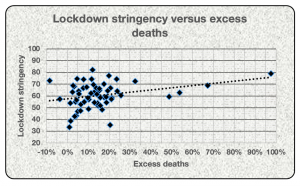
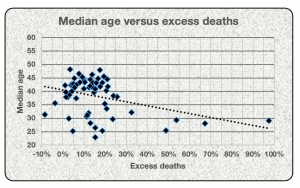
If the data from the USA and Canada does not convince you to question whether lockdown measures have any impact on halting the SARS-CoV-2 virus spreading through the population, then you may be visually impaired. I know the USA is a vast country comprising 50 different states and hence, it may not be accurate to compare the country as whole to other countries. From the published data I have seen, COVID-19 mortality rates have varied from state to state and without much correlation to lockdown measures.

I was intrigued to research whether there was any correlation between COVID-19 outcomes and economic growth/contraction in 2020. I stumbled upon IMF data about long-term GDP data per country including 2020. I tried not to look at Venezuela’s performance but I could not stop myself. That social paradise’s economy contracted by 25% in 2020 after declining 35% the year before. 2018 was slightly better at negative 19.6%. To put that in perspective, if Venezuela’s economy was US$124 billion at the start of 2018, it would have contracted to US$48.6 billion by the end of 2020. Note to Cyril, perhaps don’t ask your Twitter mate, Nicolas Maduro, for economic advice or any other earthly pearls of wisdom.

My hypothesis when analyzing COVID-19 mortality rates and GDP statistics per country was that harsh lockdowns = poor economic outcomes but better healthcare results.  I selected 55 countries globally from the IMF and from the OWID website. I tried to focus on the major countries from a population perspective and omitted countries where I suspect truth may be an inconvenient distraction (think Russia). Have a look at the data below regarding the 20 worst affected countries.

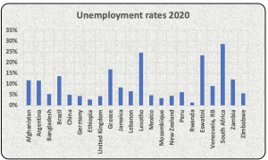
Oh my goodness, I was questioning whether I had extracted the appropriate data, so I double checked. Yip, the data accords with the original sources. So how do you explain that 11 of the countries with the worst performing economies in 2020 also had some of the highest COVID-19 mortality? It makes no sense at all. It gets worse.

My hypothesis is now completely threaded. 12 countries whose economies escaped relatively unscathed in 2020 also had very low COVID-19 mortality rates. I am calling on all economists, public health officials, epidemiologists, virologists, actuaries and any credible scientist to explain the above data. Using Excel’s CORREL function, the correlation between COVID-10 outcomes and GDP data for the 55 selected countries, was -91%. Countries with high COVID mortality most of the time had poor economic outcomes in 2020 whilst countries that had low COVID-19 mortality achieved better economically. It is inexplicable to me.

PS, South Africa has had the 27th highest number of COVID-19 deaths per capita and the 40th best GDP result out of the aforementioned 55 countries. Pretty awful, me thinks.

All the best from BeechieB.

South Africa’s unemployment crisis

Stats SA recently published its Quarterly Labour Force Survey for quarter 4 2020, reporting that the unemployment rate amongst 15 to 64 year old South African’s is 32,5%. Yeah right, we know that the data is much worse than that. Stats SA also publishes ‘expanded unemployment rates’ which reflects that 42.6% of South Africans were unemployed during the last 3 months of 2020.  The impact of the COVID-19 lockdowns did not help matters, reducing the number of those with jobs by 1.4 million people during 2020. RSA now has 15 million people of working age with jobs, and 11.1 million without. The trend pre lockdowns was bad but 2020 was horrific. You may notice in the graph below that the number of unemployed individuals has been increasing for the past 12 years, from 5.9 million in 2008 to 11.1 million at the end of 2020. For those of you who are not numerically adept, that’s an increase of 5.2 million people plus their dependents who need to rely on family, friends and the state for support.

Charts tell stories, and sometimes more effectively than words. Look at the chart below depicting RSA’s expanded unemployment rate over the period 2008 to 2020.

28.7% unemployment back in 2008 was not good but 42.6% in 2020 is inhumane. Talking about humanity and some interesting countries globally, I googled (yes, it is a word) unemployment rates globally. The World Bank had data for most of the 192 odd UN recognized countries although I am not sure about the accuracy of their data. For example, they claim that unemployment in Zimbabwe is 6%. Perhaps most able, work ready Zimbabweans are in South Africa, London or New Zealand and hence, do not rank as unemployed in Zimbabwe? Or perhaps those statisticians up north are beholden to politicians who would hate for news to slip out that economic conditions are far worse there than on Mars.

The World Bank uses the narrow unemployment definition, and according to them, RSA has the worst unemployment rate on the planet. Sports lovers, how about unemployment rates in some of these democratic upstanding countries globally? Argentina is apparently a basket case but its unemployment of 12% is most respectable compared to the Rainbow Nation. Ethopia at 3% would appear to be paradise. Greece is problematic at 17% but that poor country has been in terrible nick since their politicians lied about the extent of government debt. The IMF marched in there in 2010 and it has never been the same. Our neighbors Eswateni and Lesotho are not faring so well either, but are still below our levels. Did you notice Venezuela only has unemployment of 9%. Bollocks.

Stats SA is kind enough to provide an Excel file on its website with all the unemployment and employment data. That makes it easier to work with the data and extract relevant statistics. Thank you! The Department of Basic (sic) Education (DBE) is not as kind, providing only a 96 page report on the most recent National Senior Certificate (NSC) results. Have a look at this table which appeared on page 56 of their report. I suffered a bout of vertigo trying to read this page.

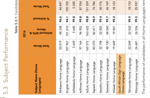
To be fair, the DBE had not yet released the Western Cape’s matric results by the time of publishing the NSC report, so an Excel or Numbers file may in the offing. Talking about NSC results, I was deeply disturbed by the raw data. Perhaps I should not have read the report and examined how poorly our 18 year olds (some may be younger and some may be older) performed in their final written assessments. Approximately 40% of the total cohort took mathematics in grade 12 and wrote the exam. Of those, 22% managed to obtain a mark of 50% or more. Sadly, only 3.2% achieved a distinction. I am not sure how employable you would be in the future smart city around Lanseria and amidst the Fourth Industrial Revolution without a reasonable mathematics foundation.

South Africa increased employment by circa 255,000 over the period 2008 to the end of 2020. President Ramaphosa speaks of creating millions of permanent jobs and 800,000 temporary employment stimulus jobs when the reality is that far too few jobs have been created. I researched which industries created jobs and which destroyed livelihoods.

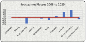
The manufacturing sector has been a blood bath with a loss of 607,000 jobs over the past 12 years. Employment conditions in the construction and trade (I assume retail) sectors have not been great either. Interestingly, the finance sector has created 543,000 jobs whilst the ‘community and social services’ sector added 720,000 odd jobs. I am guessing that the community and social services jobs entail mostly public sector employment, those fine people in parliament and in education and in healthcare. The latter hare to be applauded for their efforts amidst this pandemic. The educators less so.

I am going to end this blog with a disturbing chart. It displays the horror of all unemployment horrors.

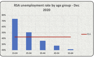
The expanded unemployment rate amongst 15 to 24 year old South Africans was a staggering 74% in the last quarter of 2020. Amongst 25 to 34 year olds, it was 51%. It seems the older are less afflicted. The median age in South Africa is 27 and 54% of our population is under the age of 30. I would opine that we have a humanitarian crisis in South Africa with regards to employment and unemployment levels.

Be safe and all the best from BeechieB.

Game stopping or game changing?

Do you know who the guy in the picture below is?

Picture courtesy of the New York Times

The guy’s name is Keith Gill and he lives in Wilmington, Massachusetts (close to Boston, USA). He is also known by his nickname on Reddit as DeepF##kingValue (apologies, I can’t use the full nickname since that may offend younger readers). I am not on Reddit but apparently it is frequented by amongst others, day traders – those people who discovered trading on stock markets during hard lockdown. Gill is a chartered financial analyst (CFA) and until recently worked for a life insurance company in marketing. Unbeknown to his employer at the time, he also masqueraded as an investment guru who has his now youtube channel called “Roaring Kitty”. He recently resigned after much success on the stock market. Gill has been trading in all sorts of unpopular shares such as GameStop, the bricks and mortar video games retailer. I have not frequented a GameStop store but there are over 5,500 outlets, mainly in the USA. Apparently, you can find everything you need to embark upon a gaming adventure. You can buy video games hardware, software and accessories in their stores. GameStop has been in decline for some years and has been badly hurt by the lockdown. We know what is happening to the retail industry globally as many larger groups have gone asunder. Companies such as Sears, JCPenny and J.Crew are no more.

I would have thought that GameStop was not a good share to purchase for various reasons. Its business model is being fundamentally challenged by online channels. It has been making losses for the past couple of years. The numbers don’t look good – I have attached an Excel spreadsheet GameStop analysis (Feb 2021) analyzing their numbers if that’s your thing. Mr. Gill has thought otherwise for some time. On 28 July 2020 he posted a rather lengthy rant on youtube about why GameStop is a compelling share to buy. He backed his convictions by apparently investing over US$50,000 of his own money in this unloved share called GameStop. The share price was US$3.94 on 28 July 2020. The GameStop share price doubled in value by 15 September 2020 and then surged in January 2021 reaching a record high of US$481.99 on 28 January 2021. That is a staggering surge in the share price. If we had invested US$50,000 on 28 July 2020 following Mr. Gill’s advice, we would have been up US$23.9 million if we sold out on 28 January 2021. I would have been thinking about retiring and setting up my own foundation called “HowtoWhackthoseHedgeFunds”.

There have been wild gyrations in GameStop’s share price over the past month. After reaching a peak of US$481.99, it declined to US$325.00 a day later. It closed at US$100.00 yesterday. The other remarkable thing about the trading in GameStop’s shares has been the volumes exchanging hands. On 26 January 2021, 178.6 million GameStop shares traded hands. That in itself may be unremarkable to some except when you consider how many GameStop shares are in issue. At 31 January 2020, its latest reported financial year-end, there were 64.5 million shares in issue.

Ordinarly, we would have congratulated Mr. Gill and his followers on Reddit for being brave enough to invest in GameStop and fair change for making many millions. However, the plot thickens. It transpires that there were some hedge funds that had shorted the GameStop shares. Without getting overly technical, short selling involves borrowing GameStop shares from some investment bank and then selling these shares on the stock market. The investment banks would require some collateral from you and would charge you some juicy fees for engaging in this unusual behavior of selling something you do not own. Short sellers would then pray that the GameStop share price would decline as they then could purchase shares at a lower price than they had sold for, making a nice profit. Hedge funds are known for identifying unloved shares such as GameStop or seemingly overpriced shares such as Tesla and engaging in short selling. Imagine that we ran a hedge fund that had engaged in short selling GameStop shares. Let’s say we had sold 1 million GameStop shares that we had borrowed from an investment bank for US$5.00 each in the firm belief that the share price will plummet to zero. The likes of Mr. Gill and his fellow day traders then unfortunately arrived and drove the share price up to US$400 per share. The hypothetical hedge fund would be in a world of pain – some US$395 million of pain since to purchase those 1 million GameStop shares would now cost US$400 million in order for us to honor our promise to return those shares to the investment bank.

It seems as if stock markets have gone mad and the man in the street can now topple the mighty financial giants such as hedge funds. Is it a game changer? Me thinks not. These hedge funds are going to spend some money lobbying Washington to ensure that the rules change to prevent these unfortunate incidents from ever happening again.

Stay safe and all the best for February 2021 – I am now thinking in months as opposed to years given this COVID mayhem. All the best from BeechieB.

COVID-19 by the numbers

I mentioned in a blog post in May 2020 how I was dismayed at how many wannabe epidemiologists and virologists there are commenting on social media platforms about the severe acute respiratory syndrome coronavirus 2 (SARS-CoV-2) and the coronavirus disease 2019 (COVID-19). We are seeing a resurgence of this at a time when the schools are closed for onsite teaching in South Africa. There is little middle ground on the debate – either opening schools is going to kill grannie and the teachers or the other school of thought is that kids rarely develop COVID-19 and are not super-spreaders. Who to believe? It is all very confusing yet you would think the scientists would debate all these topics with open minds, vigor and integrity. There should be plenty of data out there to guide the scientists towards some type of consensus of what we know and don’t know. Instead I notice esteemed scientists holding to their beliefs and ad hominem responses. The WHO is not helping the cause by changing its views on the non-pharmaceutical public health measures for mitigating the risk and impact of epidemic and pandemic influenza. I downloaded their proposals and policy statements in this regard which was published in 2019. Refer below for an excerpt from this document.

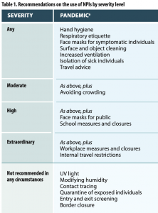
Notice that increased ventilation is recommended and not beach closures. Notice that contact tracing and quarantine of exposed individuals (aka lockdowns) are not recommended in any circumstances. And no border closures please! The WHO’s views on school closures in their 2019 document seems balanced and sensible, I quote:

“…school measures (eg. stricter exclusion policies for ill children, increased desk spacing, reducing mixing between classes and staggering recesses and lunch breaks) are conditionally recommended, with gradation of interventions based on severity. Coordinated proactive school closures or class dismissals are suggested during severe epidemic or pandemic. In such cases, the adverse effects on the community should be fully considered (eg. family burden and economic considerations), and the timing and duration should be limited to a period that is judged to be optimal…”

Mike Tyson the ex-heavyweight boxing champion famously said “everybody has a plan until they are punched in the face”. The WHO had clearly thought through plans to fight an influenza pandemic, which have plagued Earth for centuries. However, when the first punch landed in China back in early 2020, the WHO may have lacked the cojones to adhere to its stated recommendations.

Let’s have a look at some COVID numbers in South Africa. I have become obsessed with COVID numbers and have built up a significant database of all sorts of interesting stuff. The deaths per capita per province in South Africa is difficult to fathom.

The deaths per capita in the Eastern Cape and the Western Cape are incredibly high relative to Gauteng and KZN. I wonder why? The second wave of deaths is clearly evident in the chart below.

There has been much speculation about the second wave targeting younger people than the first wave. Fortunately, the data does not support that from a mortality per capita perspective.

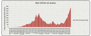
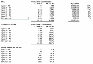
South Africa has a youthful population – ±72% of our population is under the age of 39 with a median age of 27. SARS-Cov-2 is particularly severe for the elderly and South Africa’s data supports this. Notice the much higher deaths per 100,000 for 70+ year olds as compared to the 20 to 39 age bracket? Our age based COVID mortality is not great compared to most European countries but that is another blog post on its own. COVID deaths have dramatically increased in the past 4 months. The percentage of total COVID deaths per age profile is very similar to what it was 4 months ago, not supporting the theory of the second wave hitting younger people harder than previously. Over 60% of all deaths from COVID to date in South Africa were people 60 yers or older.

The SAMRC has been scaring me for months now with their ‘excess deaths’ data. They reported on 13 January 2021 that excess deaths in South Africa for the period 6 May 2020 to 5 January 2021 was 83,918. That is a staggering amount of higher than expected deaths in country compared to prior years total deaths. StatsSA is a bit sluggish in publishing mortality data. The latest annual publication (Mortality and causes of death PO309.3 report) about deaths was for the 2017 year and that was only published in March 2020. With a declining budget, heaven knows when the next report will be out. StatSA also publishes a mid-year population report which tables births, deaths and estimate population data. This report contradicts the annual mortality report. For example, it reported that annual deaths from all causes, including those Darwin award ones, totaled 517,909 for the year ended June 2017 in its mid-year population report. The annual deaths for the year ended December 2017 was only 446,544 souls. Inconceivable!

Refer below for death data from 2002 to 2017 per StatsSA and the estimated total deaths in 2020 per the SAMRC reports.

The estimated deaths in 2020 of 912 per 100,00 population is not great compared to the 2017 data but not out of line with 2011 to 2014. The death per capita in 2004 to 2008 was insanely high but that may be due to the ANC’s denial of the HIV epidemic. So until I see more data about deaths in 2018, 2019 and 2020, I am not convinced on ±83,000 excess deaths in 7 months in 2020.

Anyway, I pray the second wave crashes soon and that we can get back to the business of living. Stay safe, follow those sensible WHO guidelines from 2019 and forgive the ANC cadres in government (because they know not what they do). All the best from BeechieB.


airbnb listing evoking memories of the dotcom bubble

Airbnb Inc. listed on the Nasdaq stock exchange on 10 December 2020. I thought it strange that any business associated with travel and accommodation would list amidst the blowout from the COVID-19 pandemic and the associated lockdowns. But Airbnb and its advisers are a brave bunch and forged ahead regardless. I must admit to having a bit of a ‘hit and miss’ experience with bookings we have made using Airbnb. Of the four places we have rented in Cape Town over the past 3 years, one has been a winner and three not so much. I recall the spot in Sea Point we rented that was up three flights of stairs and so small that we were literally bumping into each other in the cupboard sized apartment. The spot we rented in Gardens was an absolute shocker. I hardly slept during our two night stay as the noise from the street was astonishingly loud. A walk around the neighborhood revealed that a risqué club was a couple of blocks down the street and an all night retail store across the street that seemed to attract dubious characters. We rented a lovely spot in Camps Bay but unfortunately the plot next door was a construction site that was rather noisy. We finally stumbled another place in Camps Bay that is as absolute gem. I guess that is the risk of renting accommodation from private property owners which are not accredited by some travel association. I love the idea of Airbnb though and will continue to make use of its platform to find value for money accommodation.

I had some spare time this week so I downloaded the Airbnb prospectus and had a long read – the document was over 489 pages! Here are some interesting facts about Airbnb:

  • Airbnb was founded in 2007 by Brian Chesky and Joe Gebbia, two twenty six year olds. These dudes are worth circa US$11 billion and US$10 billion after yesterday’s listing. Not too shabby!
  • Before COVID-19, 54 million active bookers reserved 327 million nights accommodation using the Airbnb platform in 2019
  • Airbnb has over 4 million hosts in more than 220 countries and in ±100,000 cities and towns
  • The value of gross bookings on the Airbnb platform in 2019 was around US$38 billion
  • Sequoia Capital, a Californian based venture capital fund headed by Roelof Botha (Pik Botha’s grandson), was the anchor investor in Airbnb prior to the listing
  • Airbnb has not made a profit in any financial year of its 13 year history (cumulative ±US$2 billion losses)

I often value businesses in the course of my professional career. Sometimes these are in friendly circumstances and often not (think shareholder disputes, think merger & acquisition transactions, think court cases). Anyway, I built a basic Excel model (refer attached) Airbnb valuation (Dec 2020) in attempting to value Airbnb. For those of you who are into valuations and financial numbers, this could be an interesting read. For the rest of you, perhaps have a quick peek and move on. Just a warning re the numbers, Airbnb’s year-end is December so the 2020 numbers are an educated guess on my part. I will update the valuation model in March next year when Airbnb releases its final results. Valuations are based on forecasts and hence a guarantee of error – it is more important to minimize the error than to pretend to be Nostradamus.

The investment bankers valued Airbnb at US$68 a share for the purposes of the initial public offering (IPO) – implied value of US$47.5 billion of the business according to my calculations. I follow Professor Aswath Damodaran’s blog and gleefully noted his recent blog on Airbnb. Damodaran is a professor at the Stern School of Business at New York University and a highly regarded valuation academic. Damodaran attached his Excel spreadsheet to the blog post and this revealed a valuation of US$54 per share or US$36.5 billion in total for the group. This valuation was right on the money in terms of the speculation about the IPO pricing until earlier this week when the investment bankers advised an listing price of US$68 per share. Well they were way off – the Airbnb share price closed at US$144.71 on 10 December 2020 valuing the business at ±US$100 billion. How about that sports lovers?

If you had a peek at my valuation model you will have noticed that I derived a valuation range of between US$28 and US$37 per share. I am inherently conservative when it comes to valuations but US$144 a share is in a different galaxy. My model assumed that the gross value of bookings (GBV) on the Airbnb platform would reach US$80 billion by 2030 and revenue may reach US$10.5 billion. Damodaran estimated GBV of US$156 billion, revenue of circa US$22 billion and profit after tax of US$4 billion by 2030. I think those projections are a tad optimistic but it’s in my nature to be skeptical.

I am concerned that US stock markets are over-heating. Apple’s market capitalization (value) has increased by around US1 trillion in 2020. We now have four companies listed on US stock markets which are worth more than a trillion dollars each. Refer below for what has happened to the share prices of some of the tech stocks in 2020 so far.

I understand the hype around increasing online shopping but Amazon’s core business is loss making (AWS makes good money but the rest not so). What has changed with regards to Apple’s business model and products/services over the past 11 months that justifies a 67% increase in its share price? Facebook is facing an existential threat from US authorities who are recommending that it sell off Instagram and WhatsApp.

When companies share prices start disconnecting with economic reality, I fear for the widows and pensioners. I have seen this type of exuberance before in stock markets. I hope I am wrong but I have a foreboding of a lot of pain and suffering coming from over priced financial assets.

All the best from BeechieB.

SABC, another SOE on the ropes

My interest in the affairs, and particularly the finances, of the SABC has piqued in recent weeks as I read about government’s plans to turnaround this behemoth. The Department of Communications and Digital Technologies published a white paper on audio and audiovisual content services policy framework in October 2020 for public comment. I have no appetite to read this 153 page document and instead relied on media reports of aspects of the white paper. Apparently government want to transfer the responsibility of collecting TV license fees to Multichoice, Netflix, Showmax, Amazon Prime Video and AppleTV+. It suggests that Multichoice and subscription video on demand services (SVODs) such as Netflix should add annual TV license fees to its bills to South African subscribers and pay over collected amounts to the SABC. What an absolutely absurd idea. Imagine Netflix discontinuing your subscription because you failed to pay your SABC TV license?

Let’s talk about the TV licence mess. The SABC disclosed in its 2020 annual report that it had billed 9.5 million television license holders a total of R4.08 billion during the financial year. It only recognized R791 million of this as revenue in its financial statements as it expected that 81% of people owning TVs would not pay annual license fees. The SABC uses strong words such as ‘evasion’ to describe this behavior but I suspect South African citizens are revolting for different reasons. Imagine the collections in the 2021 financial year (FY) given the horrendous consequences of the COVID-19 lockdown? The TV license debacle gets worse when we consider how much the SABC spends on revenue collection and its annual bad debts write offs. The SABC spent R1.089 billion on revenue collection in FY2016. You should know all about that – those irritating text messages and those evening phone calls from debt collectors urging you to pay your TV license fees or else you will be reported to a credit bureau. Fat chance that had any affect on most South Africans. The SABC discontinued disclosing what its spends on revenue collection services after FY2016, presumably to avoid those awkward questions in parliament every now and again. It turns out the SABC is also not good at collecting corporate revenue – it wrote off a cumulative R425 million as bad debts over the 5 year period ended 31 March 2020.

I have attached an Excel spreadsheet SABC analysis (Dec 2020) analyzing the SABC financials over the period FY2012 to FY2020. It is not pleasant reading. The SABC’s financial position and profitability was okay until FY2015. In FY2014 it made a profit of R464 million before tax and had R1.4 million in the bank. Something tilted in FY2015 and it showed in the numbers as the organization incurred an operating loss of R601 million. I will give you a clue as to the causes – recall the mass resignation of the board of directors in 2013 and the reappointment of Hlaudi as Chief Operations Office? Recall Hlaudi’s antics as COO until his removal in late 2016? The SABC seems to have revolving doors at its head office – refer below for a list of its chairpersons and CEOs over the past decade (curtesy of wikipedia).

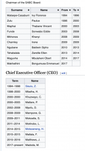
You may recall Dr Ngubane’s (chairperson from 2010 to 2013) antics at the SABC and subsequently as Eskom chairperson. Ms Suzanne Vos made some damning statements about Dr Nbubane to the Parliamentary Monitoring Group in March 2013 following the mass resignations from the SABC board. She stated that Dr Ngubane was prone to making unilateral decisions without consulting the rest of the board of directors. He attempted to overturn board decisions such as the relieving Hlaudi of his position as acting COO. Dr Ngubane apparently also failed to attend meetings if he was angry or did not get his own way. That type of behavior clearly works as he was then entrusted to chair Eskom through difficult times. He was spectacularly unsuccessful at that and we are all living with the consequences of irregular power and another debt laden SOE (refer an earlier blog about Eskom and its inability to trade out of its debt burden).

The list of cabinet minsters in charge of inter alia the SABC is also quite revealing.

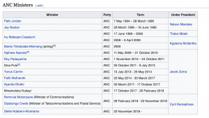
The ANC seemed to take the Department of Communications seriously at the start of its rule by appointing heavyweights such as Pallo Jordan to oversee matters. Unfortunately, some of the appointees over the past 10 years had questionable reputations. Dina Pule was apparently adept at lying and cheating to benefit her then boyfriend back in the days. Faith Muthambi has been implicated in state capture given evidence at the Zondo Commission. She must have done some naughty stuff for OUTA to have laid treason and corruption charges against her in 2017.  Mention Nomvula Mokonyane and I think Bosasa and Xmas braai packs. Stella Ndabeni-Abrahams was caught flagrantly disregarding lockdowns regulations earlier in 2020. She is now in the news for overturning the SABC board of directors decision to retrench 400 employees. Perhaps Stella needs to do a Corporate Governance 101 refresher.

Getting back to the SABC numbers, revenue seems to be under enormous pressure. Advertising revenue has declined from a peak of R6 billion in FY2016 to just over R4 billion in FY2020. The SABC records government grants as revenue, a very strange practice indeed. Imagine the creative accounting that could occur in the private sector if we could record monies received from shareholders as revenue? Total revenue at the SABC has been steadily declining in recent years and this trend is likely to continue as corporates and government finances remain under pressure.

The SABC’s largest expense items are content and salaries. I am not a SABC1, SABC2 or SABC3 viewer so I am unable to comment on the quality of the TV programs and shows. However, I do know that the quality of content is a key driver to viewer engagement and numbers. The salary line is troublesome. The average salary dramatically increased from R586,370 pr employee to R726,240 a year later. I do not know of any private sector business in South Africa that could afford to pay average salaries at these levels except for investment banks which operate in a parallel universe. The average salary in FY2020 had crept up to R791,316. The SABC is facing serious challenges to stay afloat and hence, the cry to National Treasury for more bailouts to survive. Revenue is declining and expenditures are rising, a tough predicament.

I recently listened to a podcast interview of Mr Bongumusa Makhathini, the incumbent SABC chairperson. He has had a remarkable ascent from rural KZN to a graduate with a passion to making a difference in South Africa. We need more leaders like Bongumusa in South Africa. Unfortunately, he is going to struggle to steer the SABC ship to safe waters given the challenges it faces. I was gobsmacked when I heard in the interview about how much the SABC pays Sentech on a monthly basis to transmit its analogue TV services and radio station programmes. I fact checked and discovered that the SABC currently pays Sentech R72.5 million per month for signal distribution. This revenue represents ±60% of Sentech’s revenue so now we are talking about contagion effects. If the SABC goes belly up, bye bye Sentech. Apologies for stating earlier that the SABC pays Sentech on a monthly basis  – that’s not true as the SABC currently owes Senetch R340 million and is negotiating extended payment terms.

Stella and her merry crew are apparently also recommending regulations to force Netflix and other SVODs to adhere to a minimum of 30% local content on their streaming platforms. Oh my goodness, that could prove to be the end of my love affair with Netflix. Which global SVOD will allow a country at the tip of Africa to dictate to it on how it spend money on developing content? If I was Netflix, I would ignore the ANC cadres and move onto to other investor friendly destinations. I wonder if Stella and her crew thought about perhaps encouraging Netflix et al to spend money in South Africa developing new documentaries and TV series through promoting the beauty of South Africa, its cost effectiveness and by providing some tax incentives? We live in strange times.

Be safe and happy holidays. All the best from BeeechieB.


Tongaat Hulett, a tale of deception, greed and governance failure

Tongaat Hulett has been around for 128 years. It is currently fighting for survival with debt levels of ±R12.4 billion as at 31 March 2020. The story of what went wrong at Tongaat Hulett resurfaced in the media in recent weeks. Rob Rose, a journalist at the Financial Mail, is like a dog with a bone and keeps reporting on Tongaat Hulett. I guess the sub-story of Jenitha John, the chairperson of the Audit Committee of Tongaat Hulett from 2011 until her resignation in 2019, being appointed as CEO of the Independent Regulatory Board for Auditors (IRBA) has also created some angst within the audit profession. To be fair to John, I found it difficult at face value to identify the accounting irregularities upon reviewing Tongaat Hulett’s historical financial statements for the financial years (FY) ended March 2013 to 2018. I know that Magda Wierzycka would have detected these misstatements in 30 minutes but the rest of us mere mortals may be a bit slower in absorbing, analyzing and reflecting on complex financial accounting practices.

Tongaat Hulett’s operations comprise the Sugar division (sugar cane farming and processing), Starch division (manufacturing of starch and glucose products) and the Property division (development and sale of agricultural land on the North coast of KZN). Starch is the most stable of the lot. The other two divisions are rather volatile from an earnings perspective. Imagine preparing budgets for the Sugar and Property divisions – refer below for their performance over the period FY2013 to FY2018 (prior to restatement):

Peter Staude was CEO at Tongaat Hulett for 16 years prior to his retirement in late 2018. Staude had an interesting leadership style according to media reports. For example, Rose reported in 2019 that Tongaat Hulett had not had any group executive committee meetings for a two year period leading up to Staude’s departure. He apparently did not think it would be useful for group executives to formally meet. Imagine trying to run a golf or bowling club without formal committees? It would be a disaster and would create an environment for all sorts of malfeasance.

Gavin Hudson was appointed as Staude’s replacement. The former SAB Miller executive had a rude awakening early on at the helm of Tongaat discovering that things were not as rosy as he was told prior to joining Tongaat. PWC was appointed in May 2019 as forensic auditors to investigate certain of the accounting practices at Tongaat. It certainly has been a lucrative few years for PWC’s forensic division, particularly their work at Steinhoff. Steinhoff paid €40 million in fees relating to the forensic investigation and accounting support in 2018/2019 – yes sports lovers, thats over R732 million! The forensic and other consulting fees cost Tongaat a paltry R156 million in FY2020. Anyway, PWC uncovered various accounting shenanigans according to the Tongaat executives’ results presentation to shareholders and analysts for FY2020.

I have been saying for years now that accounting standards have become far too complicated. It results in very few people understanding how to record transactions and creates an environment where the ethically challenged can report whatever they deem fit. Tongaat is required by International Financial Reporting Standards to revalue their growing sugar cane to estimated fair value every half-year and at financial year-end. Yes, you heard correctly – sugar cane in the fields should be revalued to the value that could be hypothetically realized if sold as a plant prior to processing. It essentially amounts to upfront recording of profits prior to harvesting. Please do not ask me to explain why one should adopt this accounting convention since it appears illogical to me. Anyway, valuing growing plants and other biological products is not a precise science and there is room for professional judgment. Apparently Tongaat were a bit exuberant in their sugar cane valuations. The other thing Tongaat got wrong was to capitalize certain costs of growing sugar cane instead of expensing these through the income statement. The restatement of Tongaat’s FY2018 financial results was a messy and embarrassing affair for all concerned, including the incumbent auditors.

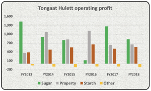
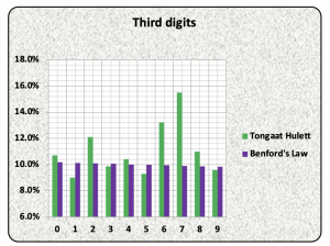
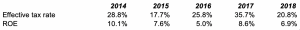
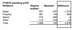
The Sugar division’s operating profit of R837 million descended into a loss of R437 million in FY2020 due to the aforementioned reasons. The Property division was also apparently a bit naughty, recording land sales upon signature of agreements rather than upon transfer. The division also saw fit to occasionally lend money to potential buyers to fund the acquisition of properties from Tongaat. No wonder Hudson and his team were struggling to collect some of their debtors book during 2019.
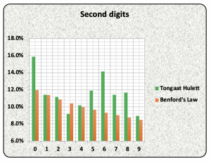
Simon Newcomb (1835 – 1909) is thought to have stumbled upon what is known as ‘Benford’s Law’. Newcomb discovered that the probability of digits (1,2,3 and so forth) occurring as the first digit in a number generally followed a particular pattern. For example, the digit 1 appeared as the first digit in numbers around 30.1% of the time. Similarly, 2 was likely to be the first digit of a number ±17.6% of the time. The length of rivers, height of mountains and populations of cities tend to be a good fit for Benford’s Law. Other data sets do not conform to Benford’s Law for example, pre-numbered invoice numbers or cellphone numbers. It transpires that financial accounting numbers are subject to Benford’s Law. Some forensic auditors swear by it and use it to identify accounting irregularities and fraud. Mischievously, I analyzed Tongaat’s reported income statement, balance sheet and cash flow statement numbers for FY2013 to FY2018 prior to restatement to see whether there was anything amiss.

It would seem as if Tongaat’s numbers were slightly off compared to what Benford’s Law would predict. The digit zero should have occurred as the second digit in Tongaat’s numbers ±12.0% of the time,  instead it appeared on average 15.9% of the time. Similarly, the digit 6 should have occurred as the second digit in Tongaat’s numbers 9.3% of the time – actual result was 14.1%.

As mentioned earlier, I struggled to find anomalies in Tongaat’s historical reported numbers. Two ratios, however, did seem odd. The first is the effective tax rate being normal taxation to be paid to SARS divided by profits before taxation. South Africa’s corporate tax rate is currently 28% and hence, I would expect Tongaat’s effective tax rate to be in that ballpark. It proved not to be. This was also the case when analyzing Steinhoff’s reported income statements. The second ratio was return on equity (ROE) – calculated as profits after taxation divided by shareholder equity. Tongaat’s was way below expectation.

Tongaat’s shareholders should have been furious that the executives were only delivering a 6.9% return on capital employed in the group in FY2018. Tongaat shareholders could obtain a yield of over 11% today if they invested in RSA government bonds maturing in 20 years time. Why allocate capital to executives who can only deliver a return of half that?

The sad part of the Tongaat saga is that the group has agreed to sell the Starch division to Barloworld for R5.35 billion. This division is the only stable profit generator in the group yet Tongaat needs to raise capital to repay debt. Its amazing how often that happens in practice – companies get into trouble and then are forced to sell the crown jewels to save the remainder. The devastating aspect of the Tongaat saga is the R22.6 billion of shareholder value that has been destroyed by management over the past 6 years.

« Older posts Newer posts »

© 2025

Theme by Anders NorenUp ↑